Redesigned computerised maintenance management solution (CMMS) for fuel, mobility and convenience retailers.

*The works showcased are examples of my previous projects created for specific clients under certain conditions and are not available for use or reliance by others without permission.
Urgent, powered by Techniche, is a native mobile app offering an automated CMMS (Computerized Maintenance Management System) and facilities management solution tailored for fuel and convenience retailers. Designed to minimize asset downtime, control costs, ensure compliance, and enhance accountability among contract technicians, the platform delivers streamlined management.
As a Product Designer, I contributed to redesigning the user experience, fostering stronger connections between business partners and technicians.
Product designer (Me), Project Manager, and 2 App Developers.
Led a UI/UX audit and redesigned features end-to-end based on stakeholder insights.
2 months
How might we design a simple, intuitive workflow to streamline task discovery, enabling technicians to easily locate and complete their to-do tasks efficiently?
User Accessibility
Ensures compliance with WCAG standards, improving accessibility for colorblind users. Introduced tags alongside color coding to clearly indicate task statuses, making information easily identifiable for all technicians.
Simplifying the UI
Streamline the user interface by removing unnecessary information, colors, and components. Establish a clear visual hierarchy to align with the iOS Human Interface Guidelines.
Better Navigation
Improved app navigation with prominent call-to-action (CTA) buttons and an optimized menu system, enabling technicians to quickly identify and prioritize urgent tasks with ease.
Identifying and prioritizing user jobs
We identified and prioritized key user jobs across personas, laying the foundation for our MVP. Engaging business partners in interviews brought valuable insights from engineers and account managers, whose deep knowledge of Task Explore’s history and backend infrastructure provided diverse perspectives for planning the MVP.

Insights from Key Business Partners
We engaged with six stakeholders from key business partners, including BP (UK), Aecom (NL), and Parkland (CA), to explore the challenges they encountered while collaborating with technicians and gather feedback on technicians' performance and reported issues.

In this stage, we focused on streamlining task searching and scheduling workflow.

Log In
In log in process, technicians can set up Pin code or turn on Face ID after creating account to help them logging in more efficiently. There is a process bar at the top to guide them through the set-up process.

Improve Task Search
Simplified the task search process by placing a prominent "Nearby Tasks" CTA on the search page, making it easier for technicians to access.
To-do tasks can also be filtered using various parameters, such as location, with task cards automatically sorted by proximity to help technicians quickly find the most relevant options.

Simplified Task Card Design
Streamlined the task card layout to reduce UI distractions. Introduced clear tags alongside color coding to indicate task statuses, ensuring information is easily recognizable and accessible for all technicians.


Improved Navigation and Redesigned Home Screen
The previous home screen duplicated the functionality of the hamburger menu. To make better use of this space, I replaced the home screen with the 'My Task' list, allowing technicians to view their to-do tasks immediately upon opening the app.


Task Details & Account Settings


Once the core UX research and design development were completed, we collaborated closely with developers to ensure precise implementation, down to the last pixel. Additionally, we compiled a comprehensive report summarizing the insights gained from interviews and detailing the design solutions provided to the client.
Comprehensive Research Report
We meticulously documented insights from stakeholder interviews, prioritized key issues, and delivered a detailed report packed with actionable findings.
Complete Figma File Access
The finalized design file was handed over in its entirety, enabling the client to continue developing and evolving the application seamlessly.
Fully Customizable Design System
We delivered a tailored design system, optimized for effortless transfer and future reuse, ensuring scalability and consistency.
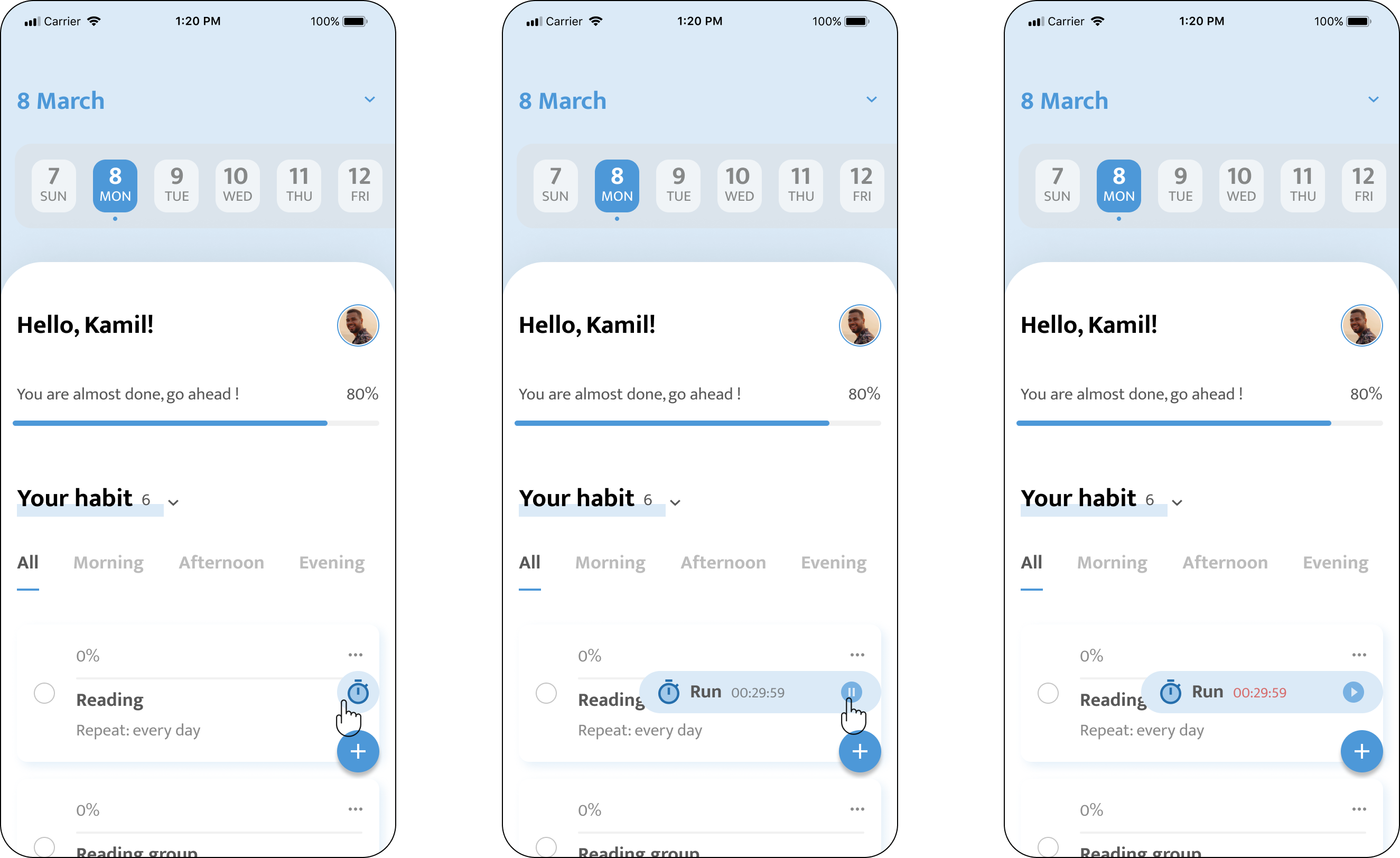
Design an innovative app to empowers users to effortlessly nurture their daily habits and successfully accomplish their goals.
UI Design
UX
Research

Overview
Habit Way is a mobile application designed to empower users in organising and cultivating their daily habits, enabling them to achieve their goals. It provides a host of features like Habit Tracking and Monitoring, Intelligent Reminders and Notifications, Customisable Habit Settings and Insights and Analytics.
Product Designer
Deliver a comprehensive design solution encompassing product wireframes, interactive prototypes, a cohesive design system, high-fidelity UI mock-ups, concise copywriting, and seamless collaboration with developers to ensure timely and feasible implementation of the design.


Customisable habit repeat pattern

On Repeat pattern setting page, to meet users’ various requirements we provide a proper ability for them being able to customise the repeat pattern. To make this process easy to start, I design a process with good priority.
The first thing on this screen is to set up the name of the habit, the starting date (end date is optional), the type & goal and the repeat pattern. On this screen, users have a simple repeat pattern to choose, eg Repeat every day, week or every other week. If they need more, they can click ‘Custom’ to set up their favourite repeat pattern.

On the Custom repeat pattern page, we start with choosing the Frequency, such as Daily, Weekly, Monthly or Yearly. For example, users can choose the habit repeat every three days, repeat three times every month on 3rd, 13th and 23th, or repeat every month on the first Monday.
After finishing setting up the repeat pattern, it will show the description to let users know clearly their repeat pattern on the the new habit setting page.